


A public utility that decided not to look like one
Tampa Bay Water is the region's wholesale drinking water utility. The brand it needed had to feel like the community it serves, not like the sector it belongs to — and every color in it had to survive an accessibility audit.
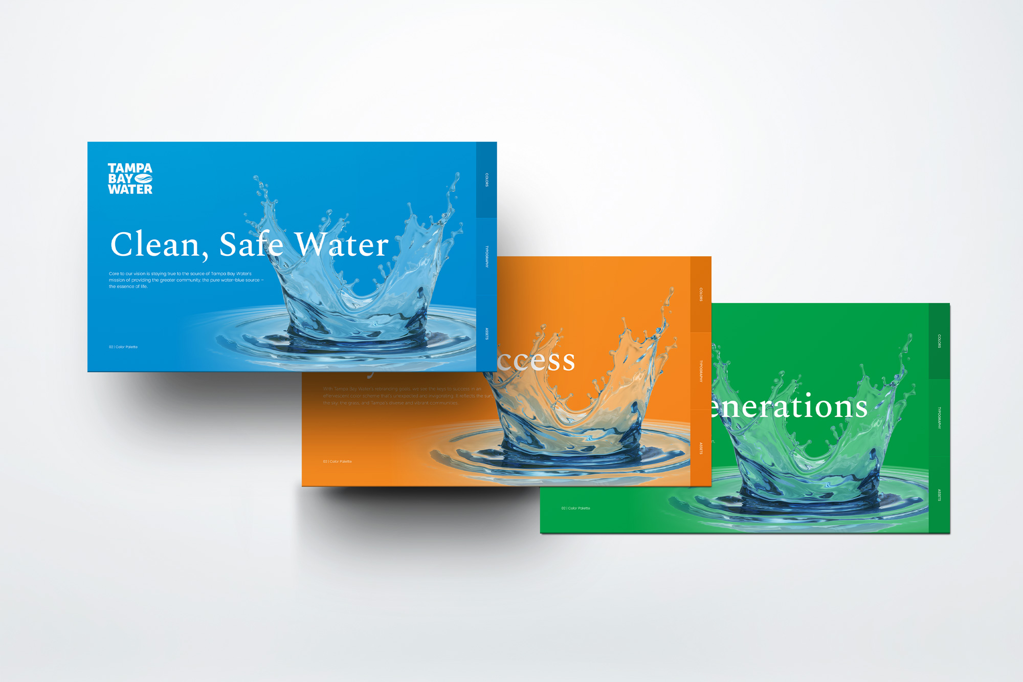
Bold and compliant, at the same time
Utility branding tends toward the same restrained blues, and for a defensible reason: a public agency has to read as trustworthy, and it has to be legible to every resident it serves. Accessibility requirements are usually what pulls a palette back toward the safe middle.
Tampa Bay Water wanted the opposite. A vibrant identity that reflects the sun, the landscape, and a diverse regional community — while meeting WCAG contrast requirements across everything from the website to a door hanger left on a resident's porch.
Those two goals argue with each other. Vivid mid-tone colors are exactly the ones that fail contrast against white. So we did not treat accessibility as a check at the end. We built the palette around it.
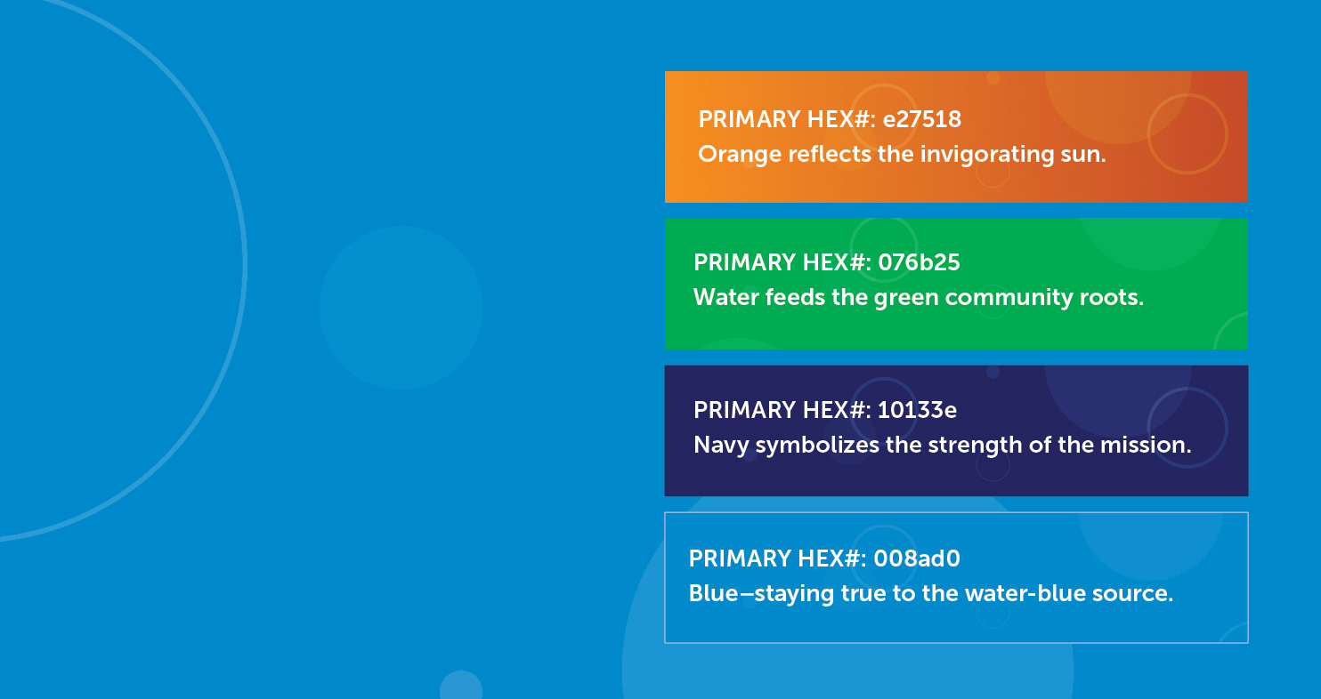
Four colors, each with a reason
Water is the source and the constant. Around it, three colors that place the utility in its region rather than its industry.
Every pairing measured before anyone used it
We ran every text and background combination in the system against WCAG contrast thresholds, then wrote the results into the style guide as rules. Designers do not have to know the math. They have to know which square they are standing on.
The vivid colors carry display type and navy text. White body copy lives on navy and green. Nothing is left to judgment in the moment.
A system, not a set of files
Accessibility-first typography, the verified color combinations, and templates for the communications the utility sends out constantly. The point was for the team to keep producing compliant material long after we handed it over.
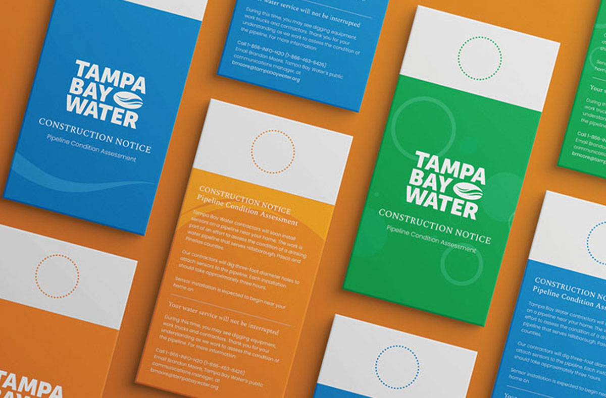
Construction notices for pipeline work, in each colorway. The type sizes and color pairings are fixed by the guide, so a notice printed in orange is as legible as one printed in blue.
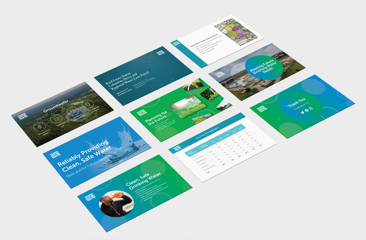
Board decks, budget reporting, and community presentations. Data tables, photography treatments, and title layouts all pre-built against the same contrast rules.
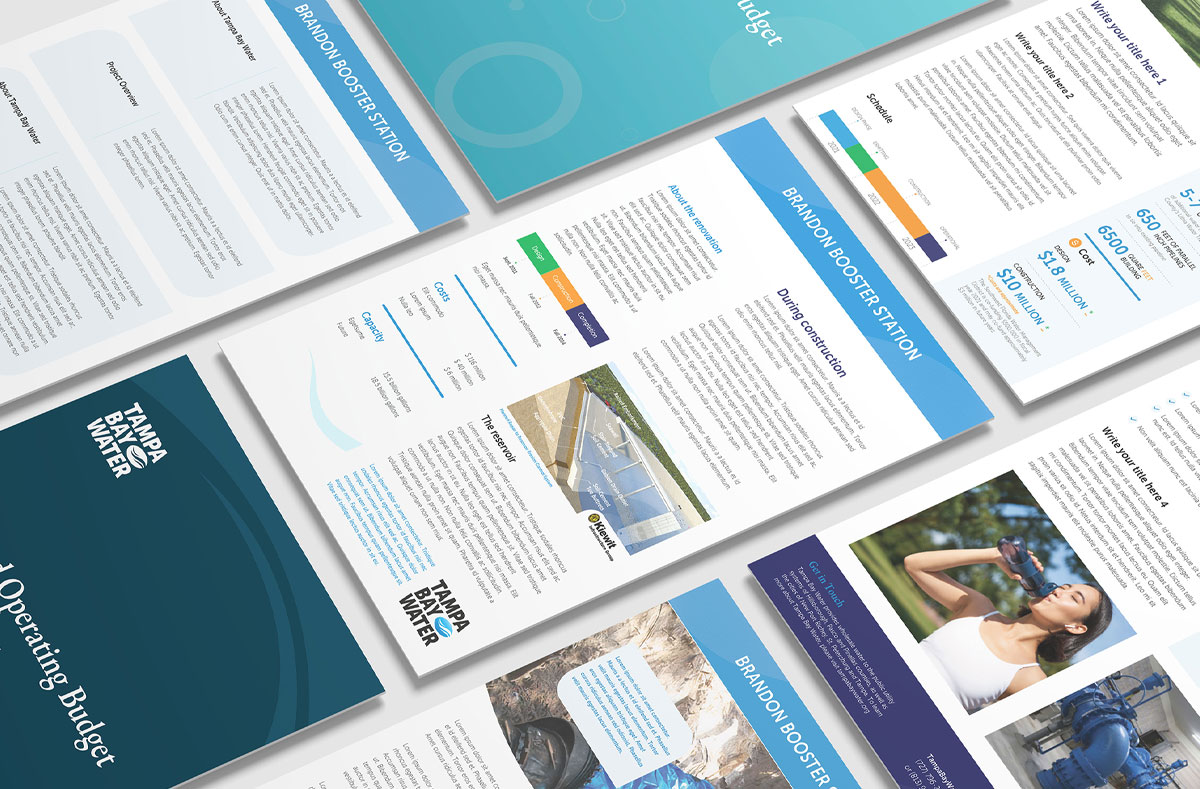
Operating budget covers, project brochures, and infrastructure explainers. Charts and schedule graphics use the palette as a coded system rather than decoration.
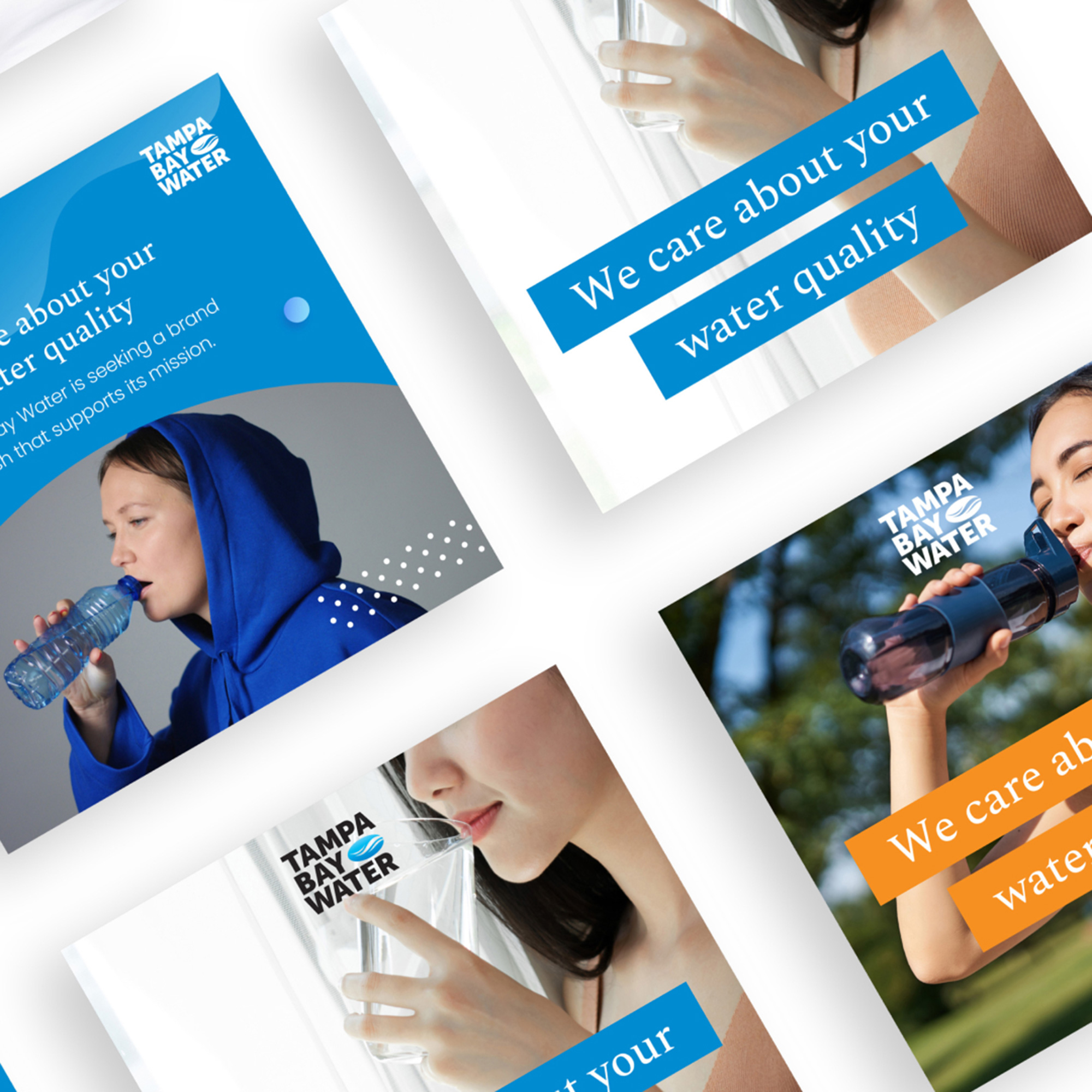
Text never sits directly on photography. A solid color bar behind every line guarantees the contrast ratio no matter what image runs underneath it.
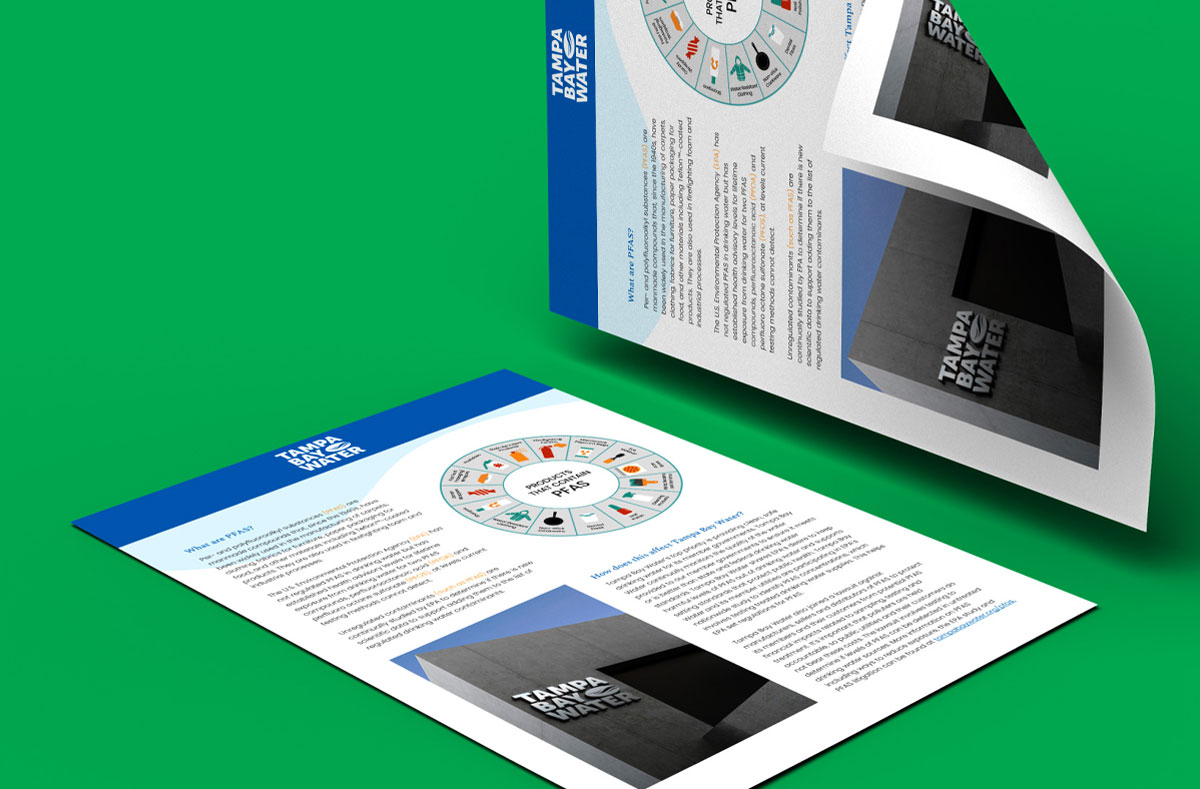
Public information sheets on subjects like PFAS, where the utility has to explain regulated contaminants to a general audience. Diagram, plain-language columns, and a fixed type hierarchy doing the work that a wall of text would not.
The client took the bolder option
Public agencies are not usually the ones who pick the brave direction. Tampa Bay Water did, and what they valued was that the boldness did not cost them anything on compliance.
The system differentiates them from conventional utility branding, holds accessibility across every touchpoint, and gives their communications team templates they can use without a designer in the room. That last part is what makes a brand survive its launch.
Building the compliance in from the palette outward is what made the vivid direction possible at all. Had we chosen the colors first and checked them later, the safe blues would have won by default.
Told your brand has to be safe to be compliant?
Tell us what you are working with. A reply within two business days.