


A logo we drew more than a decade ago is still the one they use
Betty Ford Alpine Gardens in Vail is the highest botanical garden in the United States. We built its identity: the mark, the guidelines, the print materials visitors pick up at the entrance, and the site. The gardens have grown in prominence since. The identity has not needed replacing.

A first lady's name, and a garden anyone can walk into
The presidential legacy attached to the institution set the constraint before any design started. A garden carrying Betty Ford's name has to look dignified enough to honor it — the kind of mark that sits comfortably on a donor letter and in an annual report.
But the gardens are free, open dawn to dusk, and full of families and hikers who wandered over from Ford Park. Lean too far into institutional gravity and you build something that looks closed. The identity had to say both things at once, to local visitors and international tourists, and to botanists and casual garden enthusiasts alike.
The altitude is the other half of it. Being the highest botanical garden in the country is the distinguishing fact, and elevation had to register as significance rather than as trivia.
Dignity from the type, warmth from the flowers
The mark splits the two jobs between its two halves. Classical stacked serif capitals carry the institutional weight. Painted alpine wildflowers — Indian paintbrush, harebell, columbine — carry the invitation, and they are botanically specific to the place rather than generic.
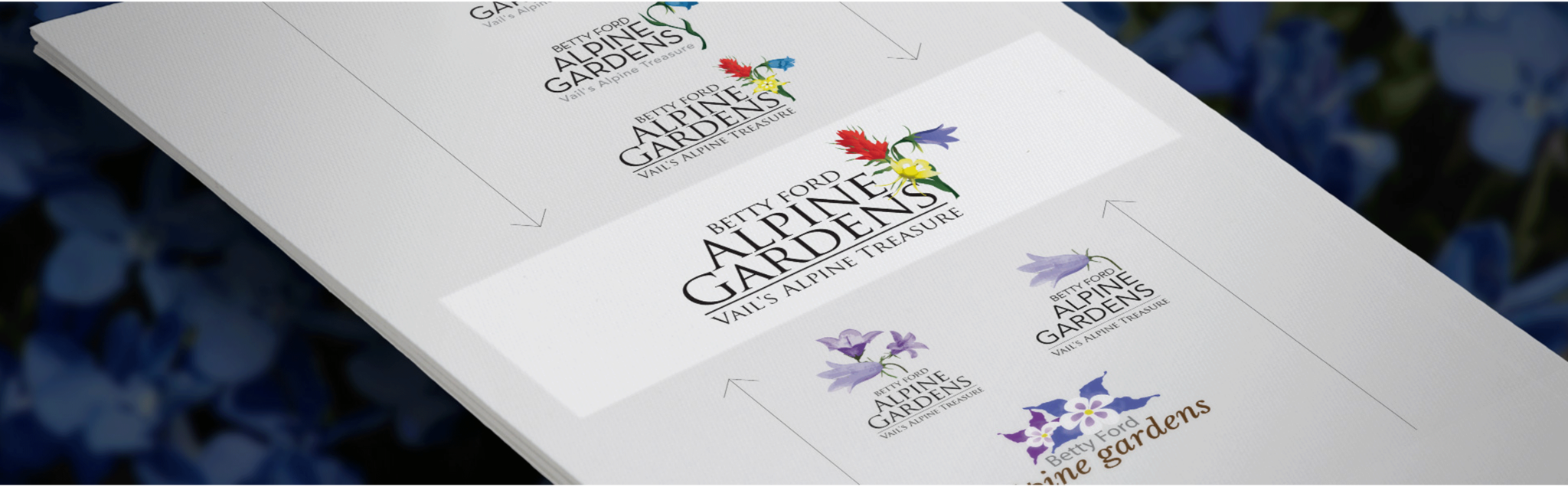
Print for the visit, digital for everything around it
A garden's audience is split between people standing at the entrance and people deciding whether to come. We built for both: print materials that answer the practical questions on site, and a digital presence that handles events, engagement, and — through e-commerce — a relationship that continues after the visitor leaves.
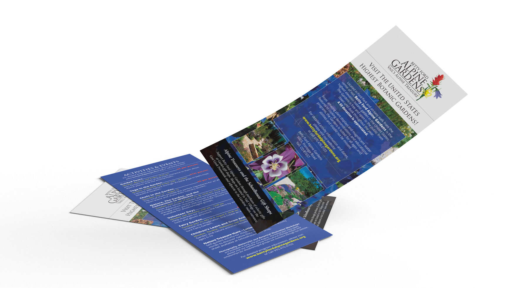
Leads with the altitude claim, then answers what a visitor actually needs: it is free, it is open dawn to dusk year round, here is how to find it, here is what is on. The activities panel doubles as the events calendar.
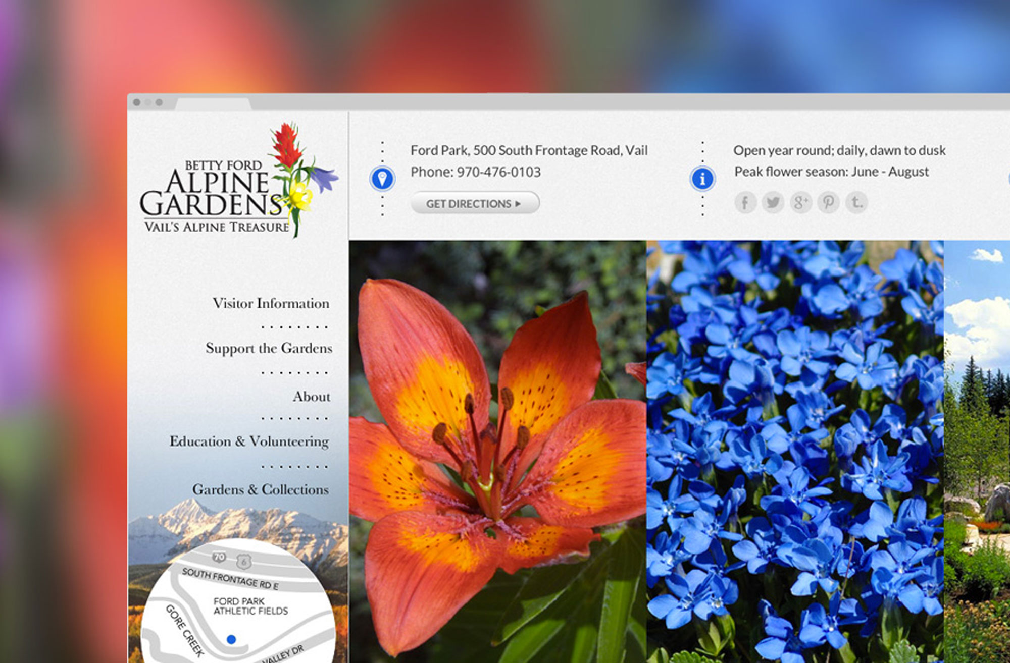
Hours, address, directions, and peak flower season sit above everything else, because those are the questions. Below them the photography gets the full width — the one place where the gardens should sell themselves.
The quietest kind of success
The identity still serves as the gardens' visual ambassador more than a decade after we made it. It has moved onto platforms that did not exist when it was drawn, and it has scaled with an institution that has grown in prominence and visitor numbers, without losing the prestigious-yet-approachable character it was built to hold.
There is no metric for this, which is the point. A brand that never needed to be redone does not generate a case for itself. It just quietly keeps working, and the money that would have gone into replacing it went into the gardens instead.
Need an identity that will still work in ten years?
Tell us what your institution has to be to the people who fund it and the people who visit it. A reply within two business days.